Activities Overview
Let’s start out with a couple of definitions. Slides, Activities and Activity Slides are used interchangeably within DirectorStudio and all amount to basically the same thing, a user interface screen that is displayed as content to an Audience. Activities alone often refer to the various elements on a slide, like text or an image. Action Activities are non-visible actions that perform a useful function for the presenter, these are similar to macros. Action Activities are discussed in-depth on its own Help section named Action Activity. Each Slide Activity and Action Activity contain a collection of properties that may be set to achieve the desired appearance or effect. This collection of properties is displayed on a form. Some properties are common among Slide Activities based on the capabilities and requirements of the Activity.

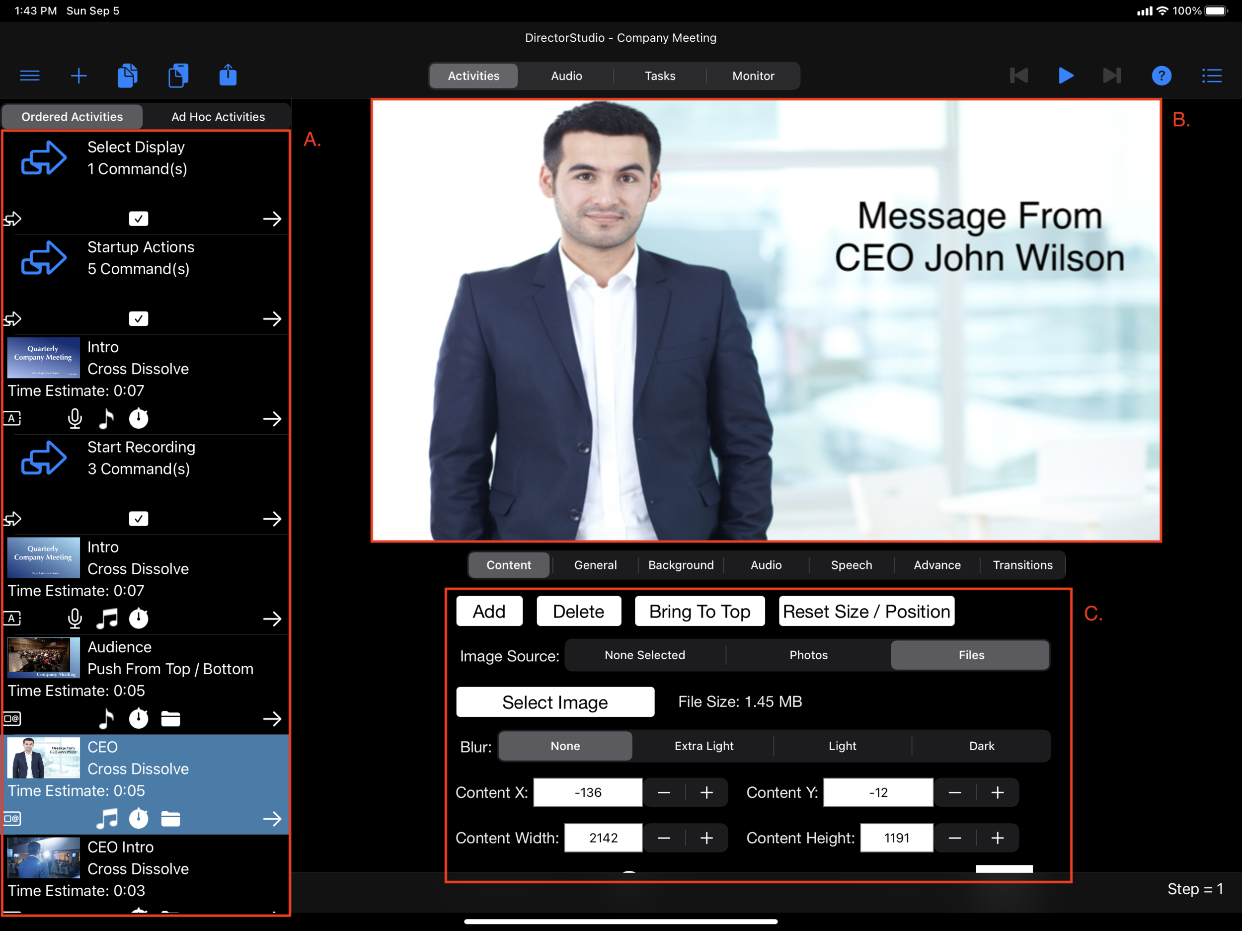
The Slide Activity editor is divided into three main areas. A. List of Slide Activities. B. Slide Layout Preview. C. Slide Activity properties. Additionally the toolbar gives access to a number of features.
List of Slide Activities
There are two list of activities. Ordered and Ad Hoc Activity Lists. The desired list can be selected by choosing the tab above the list. The Ordered Slide Activities are specific Slides Activities used for the Event Presentation. They define the playback sequence order and the Event is generally played back in this order. The Ad Hoc Slide Activity list is a list of reusable Slide Activities that are shared among all Event Presentations and can be selected on demand to change the event flow. Some examples of Ad Hoc Activities are a “Fade to Black” or a “One Moment Please” or an Ad or a common Action Activity to turn on a HomeKit light. The Ad Hoc Slide Activities can be accessed when presenting an event by selecting the Ad Hoc tab of the Control area. Ad Hoc Activities may only play Background audio and you must manually select the next Activity (Ordered or Ad Hoc) to display. A Slide Activity can be added by selecting the ‘+’ button above the list. The Activities in both Ordered and Ad Hoc may be deleted by swiping from left to right and then selecting the delete button. The Activities may also be reordered by pressing on a row until it “lifts up” and then dragging to the desired location.
Icons - The Icons are indicators for settings for the slide (Not all icons are visible in the graphic above)
Slide Type
Enabled Status
Spoken Word
Audio Type (Background and / or Activity Audio)
Transition Type
Storage Indicator
PIP Status
Perform Upon Completion Action
Slide Layout Preview
The various Activities that make up a Slide Activity are rendered in an interactive preview area. Multiple Activities may be added, deleted and moved within the Slide Layout Preview. Properties for the selected Activity may be modified using the form for on the Content tab of the Slide Properties (see below).
Slide and Activity
A collection of setting for the Slide Activity divided by tabs to allow Focusing on specific properties of the Slide Activity. If a property is required to have a value or a selection it is flagged with a red bubble with an exclamation mark. This indicates that the Activity will not be included in the Event Presentation unless the value is entered or selected. The count of errors is accumulated and displayed in the lists and screen selection tabs through out the application.
Content - For the selected Activity (an image for example), all of the properties associated with the Activity are displayed, allowing for a high degree of customization. Please see the corresponding help page for each Each Activity Type for details. Below the Property Selection bar a group of buttons allow adding an Activity or modifying the selected Activity.
Add - Add a new Activity
Edit - Modify settings for the selected activity
Delete - Permanantly delete the selected activity
Bring To Top - Place the selected Activity on top of all other activities on the Slide.
Reset Size / Position - Reset the size and location of the selected Activity to the defaults.

The Selected Activity is surrounded by dashed lines and four anchor buttons. The anchor buttons allow you to resize the Activity and dragging the Activity allows moving the Activity to anywhere on the slide. On the form are the position values which may be manually set to give a precise location. Additionally the Activity position be manually set.
LabelX - the distance in Pixels from the left border of the Slide
LabelY - the distance in Pixels from the top border of the Slide
Label Width - The width of the Label
Label Height - The height of the Label
General
Select the Slide Name
Enabled State - Disabled Slide to not appear in the Event Presentation.
Lock Slide to disallow any changes.
Perform Upon Completion - Perform Upon Completion will determine how the current Activity slide will behave when it is automatically transitioned. If the Slide Advance type is manual or the user manually requested to go to the next or previous slide, this option is ignored and the manual request to move is honored. (Does not apply for Ad hoc Activity Slides)
Next Activity / Restart Event - The Next Slide is displayed or if the current slide is the last slide to the presentation, the presentation will start again from the beginning.
Do Nothing - The Slide will not automatically proceed, it just stops.
End Event - Stop Event Playback and the Event ends

Background - When desired, using a background color scheme that is different from the Event presentation is possible by updating the values of the Background tab. By selecting Use Custom Background the it is possible to change the slide’s background. The selection of colors to display on the background, a single color or up to three colors as a gradient. To include more than a single color enable Color 2 and / or Color 3. To change the color tap on the color, select an enabled color rectangle and select from the color popup dialog. Changing the value of the Top and Bottom Tilt sliders vary the angle of the colors.

Audio For slides that will play audio the selection of the audio type to play must be selected.

No Audio - No audio will be played
Background Audio - Only the current background audio selection will be played - this is continuous when consecutive slides each select Background Audio
Activity Audio - The Activity Audio will be played and a selection for which Activity Audio Activity must be made. (See Below)
Play Both - Both the Background Audio and the Activity Audio will play, an Activity Audio must be selected.

For Activity Audio you may select which Audio to play. Each Slide may select a different audio track or if consecutive slide select the same Activity Audio playback is continuous and repeated. It is also possible to create and record audio for the slide from the Audio tab. Lastly, if the Activity Type is a recording and there is a Video Activity on the Slide Activity a button will appear (not on the screenshot) that will allow the user to play the video while also recording the audio.
Speech - If desired, some slides have the ability to speak designated text as a part of the Activity Slide’s presentation. Once enabled, enter the text you would like to have Siri speak and select the relative volume. The “Test Speech” button will allow you to preview the output. The selection for the voice Siri will use along with other setting can be customized how the voice sounds using the Preferences dialog available from the Main Menu.

PIP - Picture in Picture for
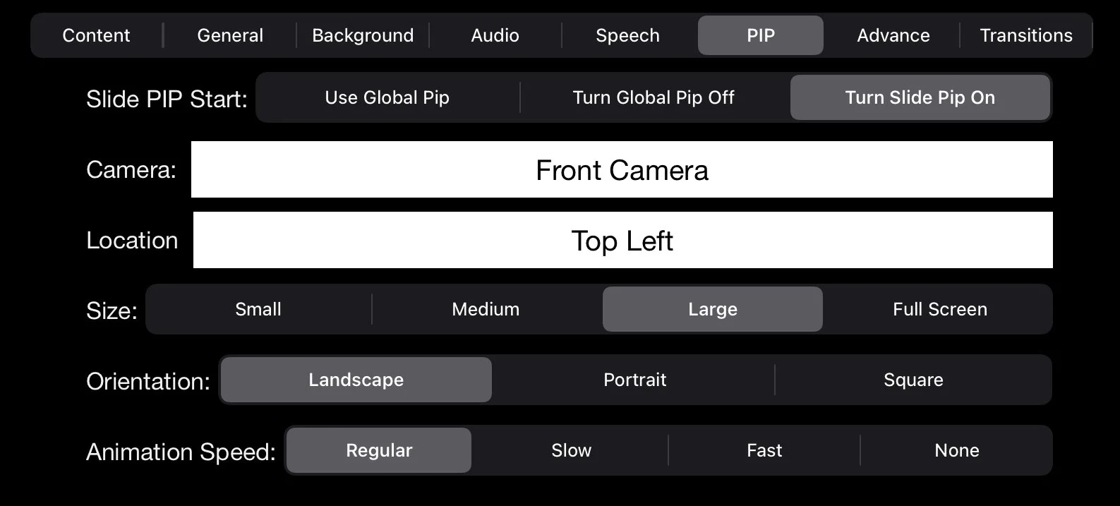
Use Global PIP - The state of the Global PIP is not Changed - If it is on it stays on, if it is off it stays off. Additionally if a slide turned it off, the PIP will turn on again to resume the “Global State”
Turn Global Pip Off - Turns the Global PIP, as mentioned above the Global PIP is turned off only for this slide and will resume as indicated by the settings of other slides
Turn Slide PIP On - Overrides the settings of the Global PIP and uses the settings as indicated below. The PIP settings can resume to previous setting or turned off, etc. when the next slide is selected.
Camera - Depending on the iPad type, select the desired camera
Size - Select the PIP size, Small, Medium, Large or Full Screen
Location - Select one of 9 locations on the screen for the PIP location, Top left, Top Center, etc.
Orientation - Select the PIP shape, Landscape, Portrait or Square
Animation Speed - Select the speed of animation when resizing or moving the PIP. Regular (1.25 seconds), Slow (2 seconds), Fast (0.5 seconds) and None (immediate)
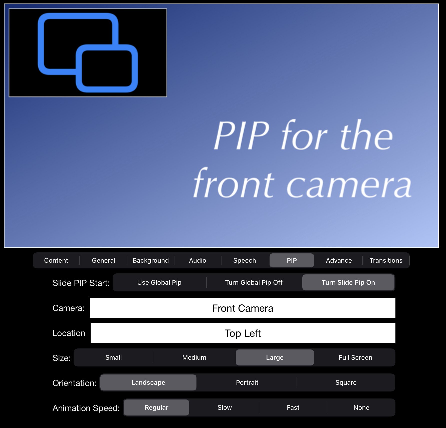
The preview area with the placeholder for the PIP location and size.
Advance - Slide Advance determines how the Activity Slide progresses to the next slide during the presentation.

Options
Manual - User manually selects when to progress to the next slide
Activity Completion - Once the process of the Slide has completed, it will automatically transition to the next slide. Some examples are the completion of the transition, a video completed and the spoken text finishes. The completion of a audio is not included as an option for Activity Completion.
Timed - Once the transition has completed and the amount of time in minutes and seconds designate, the next slide will be automatically presented. (See Above)
Specific Time - The Activity Slide automatically transitions when the time designated is reached.
Event Start - When the specific Event date and time happens the Slide advances.
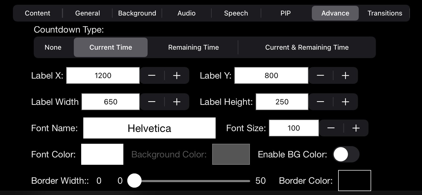
Countdown displays a label on the slide with the current time, the countdown time or both on a label in the slide display. This option is available for only certain slide types and slides that have a Slide Advance type of Timed, Specific Time and Event Start. The label properties are similar to that of the “Display Text Label”. The Label may be dragged around on the Preview or precisely set using the X/Y coordinates. Additional settings for font, color and border are also available.
LabelX - the distance in Pixels from the left border of the Slide
LabelY - the distance in Pixels from the top border of the Slide
Label Width - The width of the Label
Label Height - The height of the Label
Font Name - The Font to be used by the Label
Font Size - The size of the Font
Font Color - The color of the Font
Enable BG Color - Optionally the background color of the label. Disabling this will give the label a clear background.
Border Width - The width of the content’s border. 0 for no border
Border Color - the border’s color
Reset Size / Position - Move the Countdown Display to the default location.
Transition

The transition between slides can be animated with any of the 16 transition types. The transitions are actually pairs that allow the slide to do the reverses transition if the desire is to return to a previous slide.
Transition - The type of transition to perform to viewing the Activity Slide
Transition Duration - The time in seconds the transition should take
Preview Transition - Select to get an approximate viewing of haw the transition will look.
Toolbar
The toolbar provides a number of capabilities to you Activity Slides
Add Slide -Add new slide after the currently selected slide.
New Slide - A General Purpose Activity Slide that may contain labels, images, etc.
Bible Verse Activity - A Slide that enables the definition of a sequence of Bible verses to be defined and presented.
Action Activity - Create a Slide that performs one or more action during an Event. Control HomeKit Switches, ATEM Mini Controls & Macros, other presentation automation and mush more.
Multiple Slide Activities from Photos - Select multiple images from the Photos library and each will be imported with as a new slide.
Multiple Slide Activities from Files - Select multiple images from the Files App and each will be imported with as a new slide.
Copy - the screen of the preview is copied to the clipboard
Paste - a new Image or text is pasted from the clipboard unto the current slide. A new corresponding activity will be created
Share - display the standard share sheet to share the image of the current Slide
Preview Buttons - Play / Stop, Previous and Next allow previewing Presentation playback from the currently selected Slide. If an External monitor is connected, the presentation output display to the monitor.
Help - Display Help on various DirectorStudio topics
Context Menu - In order to minimize the creating and recreating of Slide Activities, the Context Menu button (far right on the toolbar) has a popup menu that displays options for reusing Activities.
View Shared Activities - Display a popup dialog with the list of shared Activities. Tapping on an entry copies it to the current Activity List. Swiping to the left allows deleting the shared activity from the list. Once copied it may be viewed and modified. Shared activities may be copied to and between any Event. This option is only available if one or more slides have been previously shared.
Duplicate This Activity - A copy of the current Activity is made and added to the Activity List
Share This Activity - Make a copy of the current Activity and place in with the Shared Activities for reuse.
Move an Activity - Moves an Activity between the Ordered and the Ad Hoc Activity list
Set Theme for Background & Label - Update the theme for the background and label for all slide in the current Event Presentation. Individual Slides have the ability to change if desired. (See Below)
Define Theme for Background and Labels
For most Event Presentations it is desired to have a common theme for the background and font types. Selecting “Set Theme for Background & Label” from the context menu allows changing the default appearance using the Define Theme Dialog.

The selection of colors to display on the background, a single color or up to three colors as a gradient. To include more than a single color enable Color 2 and / or Color 3. To change the color tap on the color, select an enabled color rectangle and select from the color popup dialog. Changing the value of the Top and Bottom Tilt sliders vary the angle of the colors.

For Labels Activity placed on a Slide the default font properties are used. Each Label Activity can override the default if desired.
Font Name - The Font to be used by the Label
Font Size - The size of the Font
Font Color - The color of the Font
Background Color - Color of the label background, if enabled
Enable BG Color - Optionally the background color of the label. Disabling this will give the label a clear background.
Border Width - The width of the content’s border. 0 for no border
Border Color- the border’s color
Drag and Drop
Dragging & Dropping content from Photos, Files, Safari or other third party App into DirectorStudio is possible for text, images and videos. Depending on where you drop the item within the App has different results. Using the other App in Slide Over is a convenient way to perform the drag and drop.
A. List of Slide Activities - A new Slide is created with the Activity Added
B. Slide Layout Preview - A New Activity is added to the Slide
C. Slide Activity properties - The currently selected activity is replaced (it must be the same type)